Completed Projects
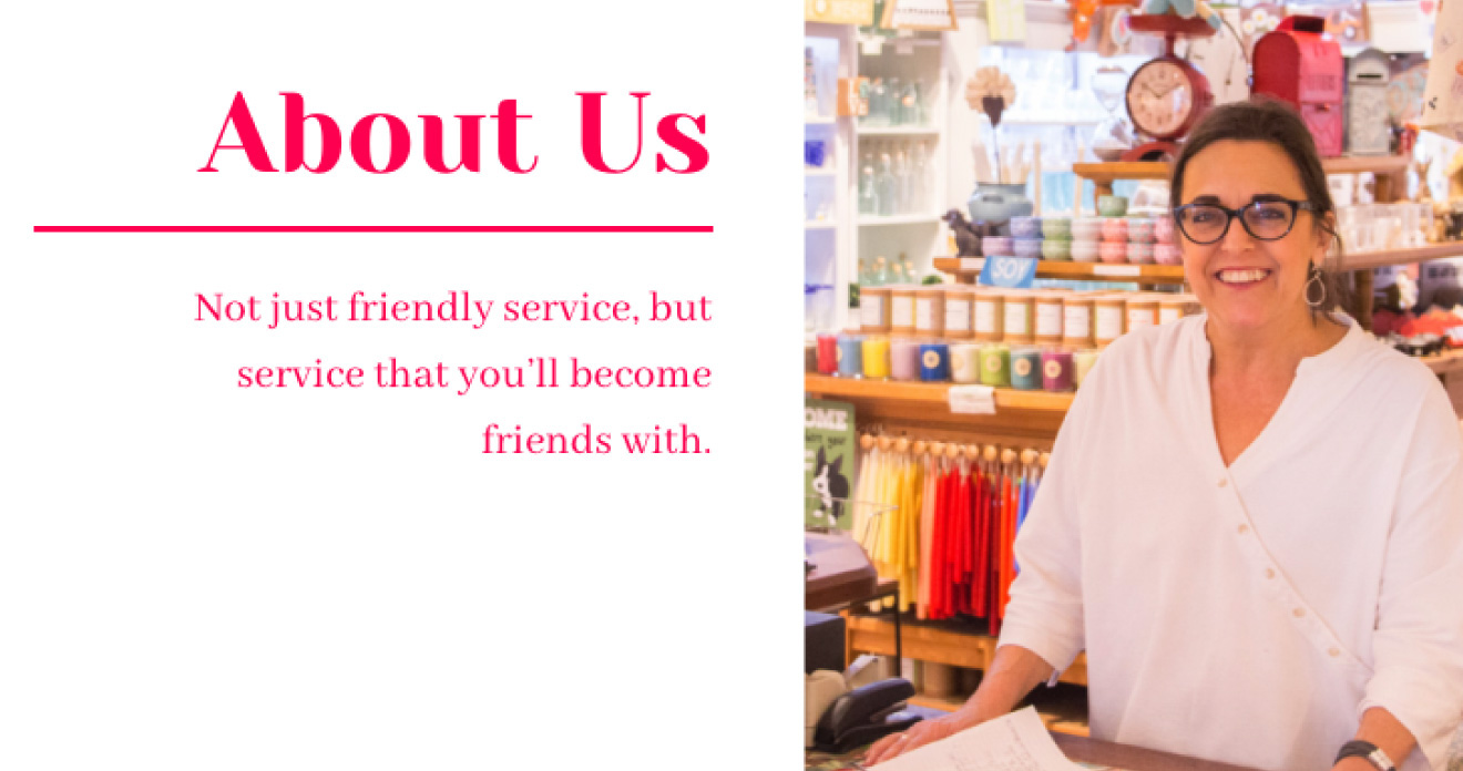
Pottery and Gift Shop
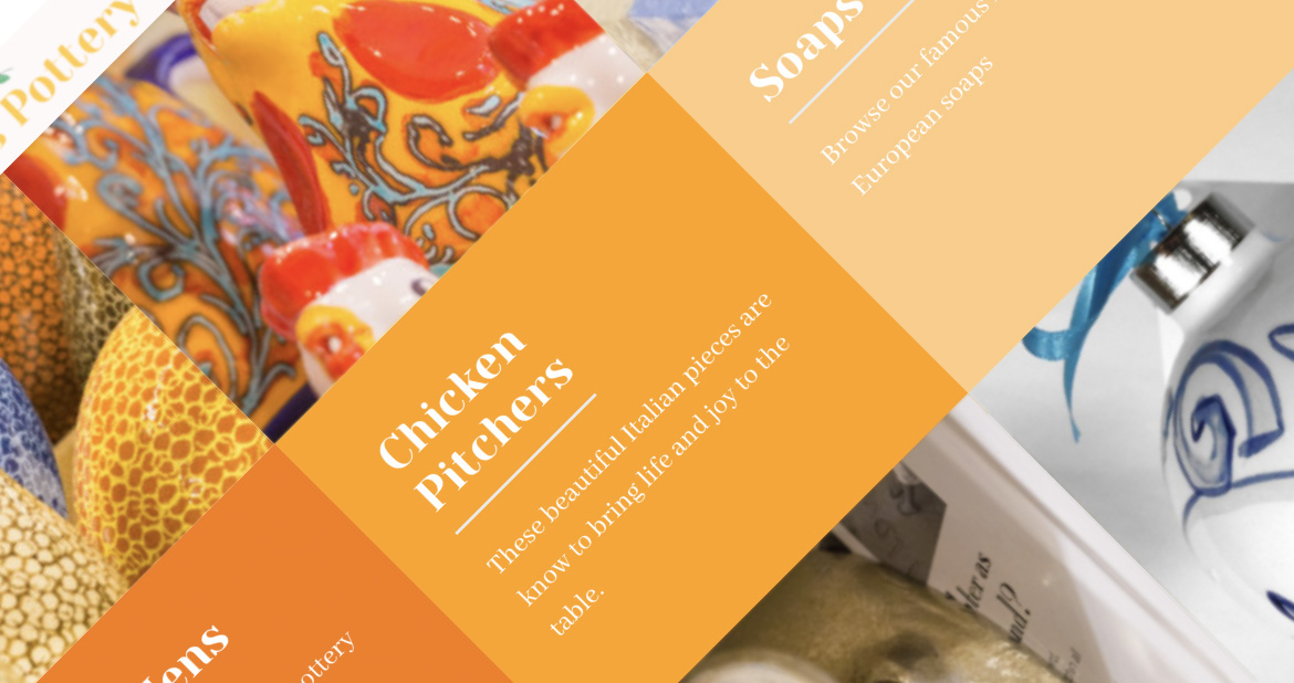
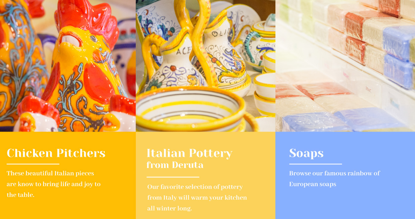
We built an online store for this vibrant shop in the center of Portland's Old Port. We tried to maintain the brilliance of color that you experience in the store with more color design than you'll see in most other websites out there.
We did
- Logo and Branding Design
- Photography
- Full Site Design
- Full Site Development
- Copywriting
- Online Store
-
Logo Design
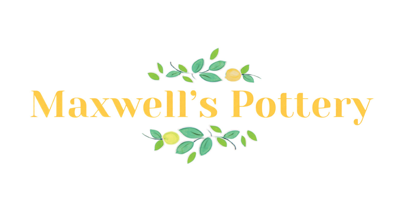
At the time, the only branding for this store was based on the carved wooden sign out front. This store is located in the center of Portland’s Old Port and that sign is an integral part of that block. What we did to make this logo was digitize the sign, carefully mask out each individual leaf, and then arrange them in a new way, keeping the tradition of that sign alive, but making it universal.
-
PHOTOGRAPHY
We love shooting our own photos, because our sites are born out of images. All the colors of the site are pulled directly from photos, we built the design of this site around how we could really showcase these images, and give a sense of what it feels like to be in this store.
-
FULL SITE DESIGN AND BUILD
We start our websites as images, so we can work with a client to perfect the look and feel before we hit the code. We base our sites in wordpress to allow clients to be able to easily add content on their own, but we make it our duty to build off of a theme and then make it unique. For this site we wrote over 1500 lines of code to make that happen.
-
COPYWRITING
When we build a site, we typically are at the forefront of building an online brand, and that includes the character of the text on the page. We base our copywriting on the principles of screenwriting: to write as if the words had been spoken. We specialize in run on sentences, slang, and hyperbole, because that’s how people talk.
-
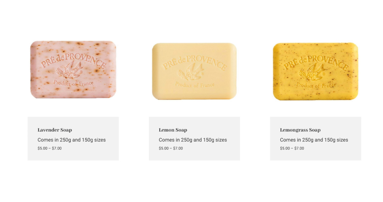
ONLINE STORE
We built a full fledged online store for Maxwell’s because we understand that sometimes the decision to buy something happens late at night, after you’ve seen the store, and you’re wishing there were a way you could have that handwarmer mug that you saw earlier.
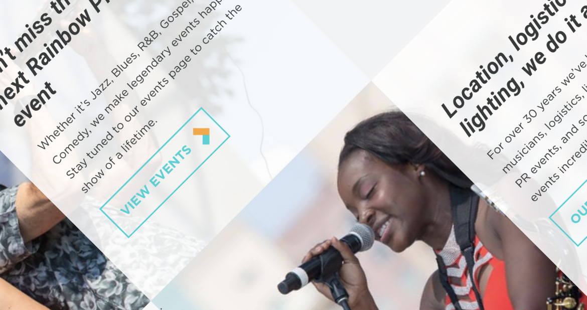
Jazz and RnB Festival Promotion Site
This is the mothership site for an event promotion company based out of Long Beach, CA. This site was designed to feel summery, sweet, and relaxing, just like the character of the music this company promotes. We wrote the copy of this site to maintain a formal, but excited tone, the voice of the people who host the party, but still know how to party.
We did
- Full Site Design
- Full Site Development
- Copywriting
- Site Management
- Management of all Subsidiary Sites
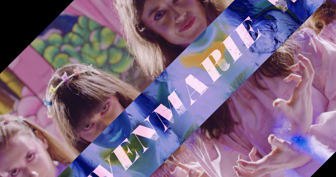
Filmmaker Website
Gwenmerie White's filmmaking brand TeenBarf is gritty, pink, and punk, and we did everything to make this site feel that way. Using some unique blend-mode techniques we did our best to expand upon the already very visually compelling content. We're honored to be a part of the splash TeenBarf is making in the filmmaking community.
We did
- Full Site Design
- Full Site Development
- Site Management
Animator and Performance Artist Website
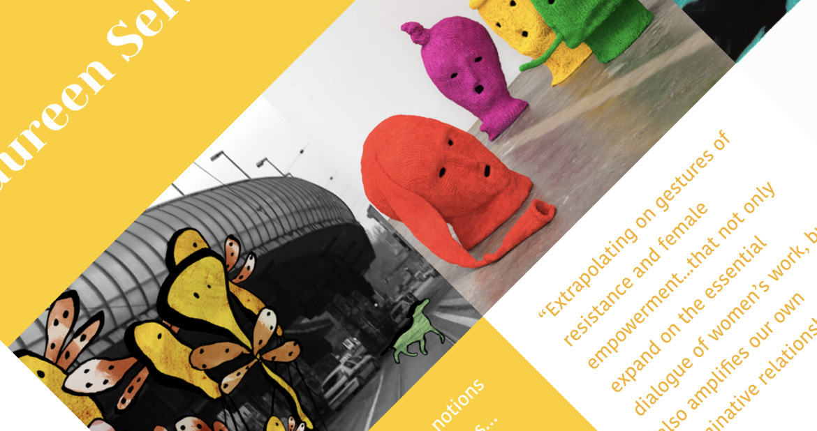
When tasked to create a site for the ultra influential pioneering animator Maureen Selwood we were challenged with designing pages for her light, airy visual work, but also her latest performance art which is almost entirely set in dark spaces. What we did is switch this site back and forth between light and dark color schemes depending on what the work demanded. In response to the character of her pieces we worked to maintain the balance between playful and professional. We did this with awkward and playful design elements, juxtaposed with solid classic design.s
We did
- Full Site Design
- Full Site Development
- Site Management
Video Installation Site
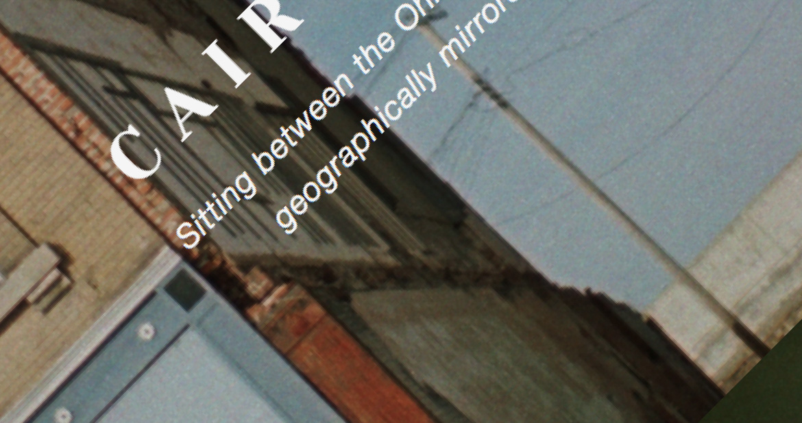
This site is designed to tell the story of Cairo Illinois, the video installation by Ross Constable. We wanted to engage the concepts of this piece on the page and essentially create a web-media version of this installation.
We did
- Full Site Design
- Full Site Development
- Site Management